Case study
Teamspective: My feedback
Redesigning the personal feedback view in Teamspective: one sketch, team buy‑in, then straight to a working prototype.
- Year
- 2026
- Role
- Product design & front-end
- Client
- Teamspective
- Stack
- Svelte, TypeScript
The problem
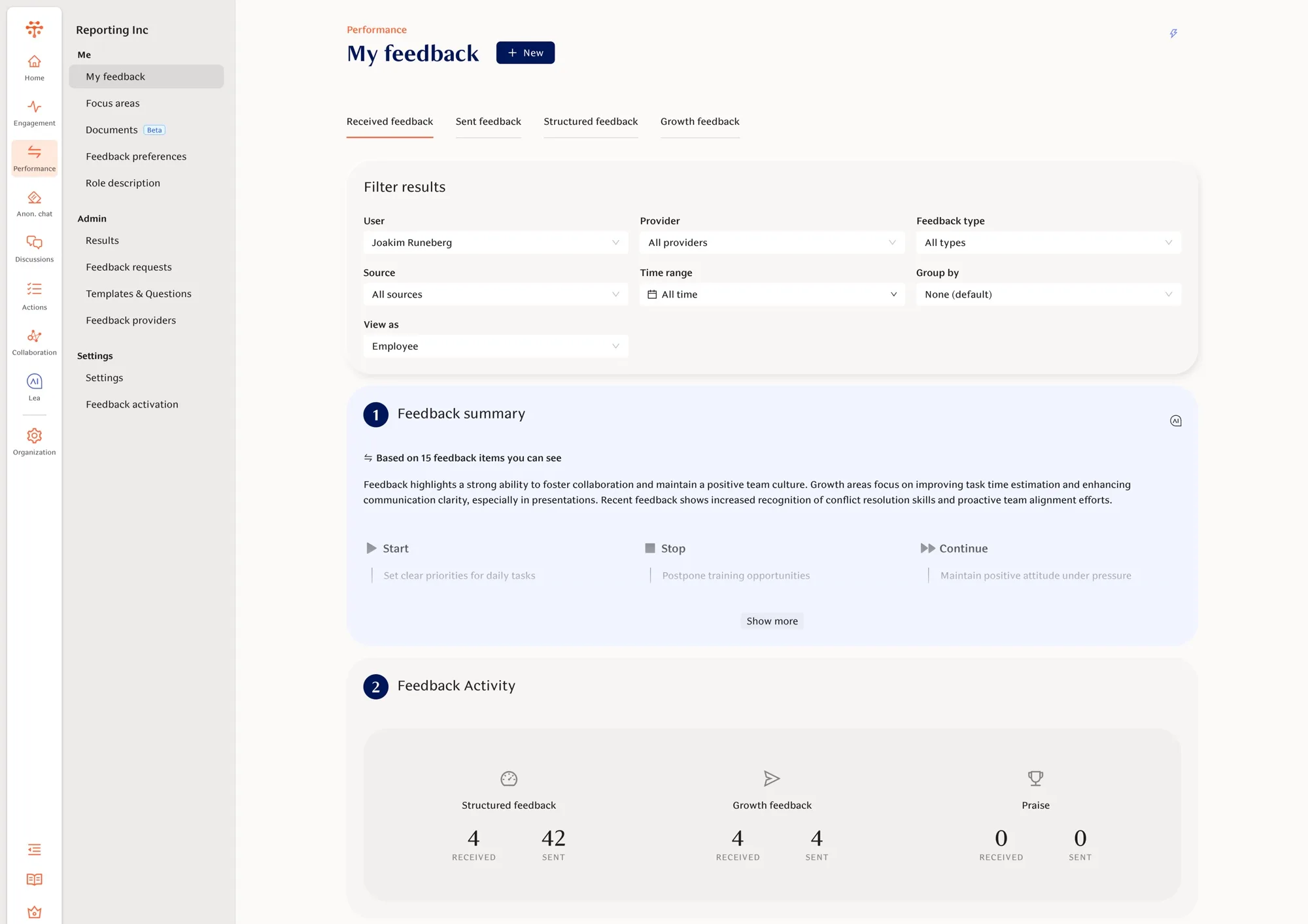
Feedback in Teamspective accumulates over time (360s, quarterly rounds, ad‑hoc praise and growth feedback), and the personal view had grown around finding it rather than reading it. The page opened with a filter form: seven dropdowns for user, provider, type, source, time range, grouping and role, then an AI summary, then activity counts. The feedback itself came last. A person opening “My feedback” should see their feedback first, and the shape of it (who it came from, when, praise or growth) without configuring a query.
One sketch, one conversation
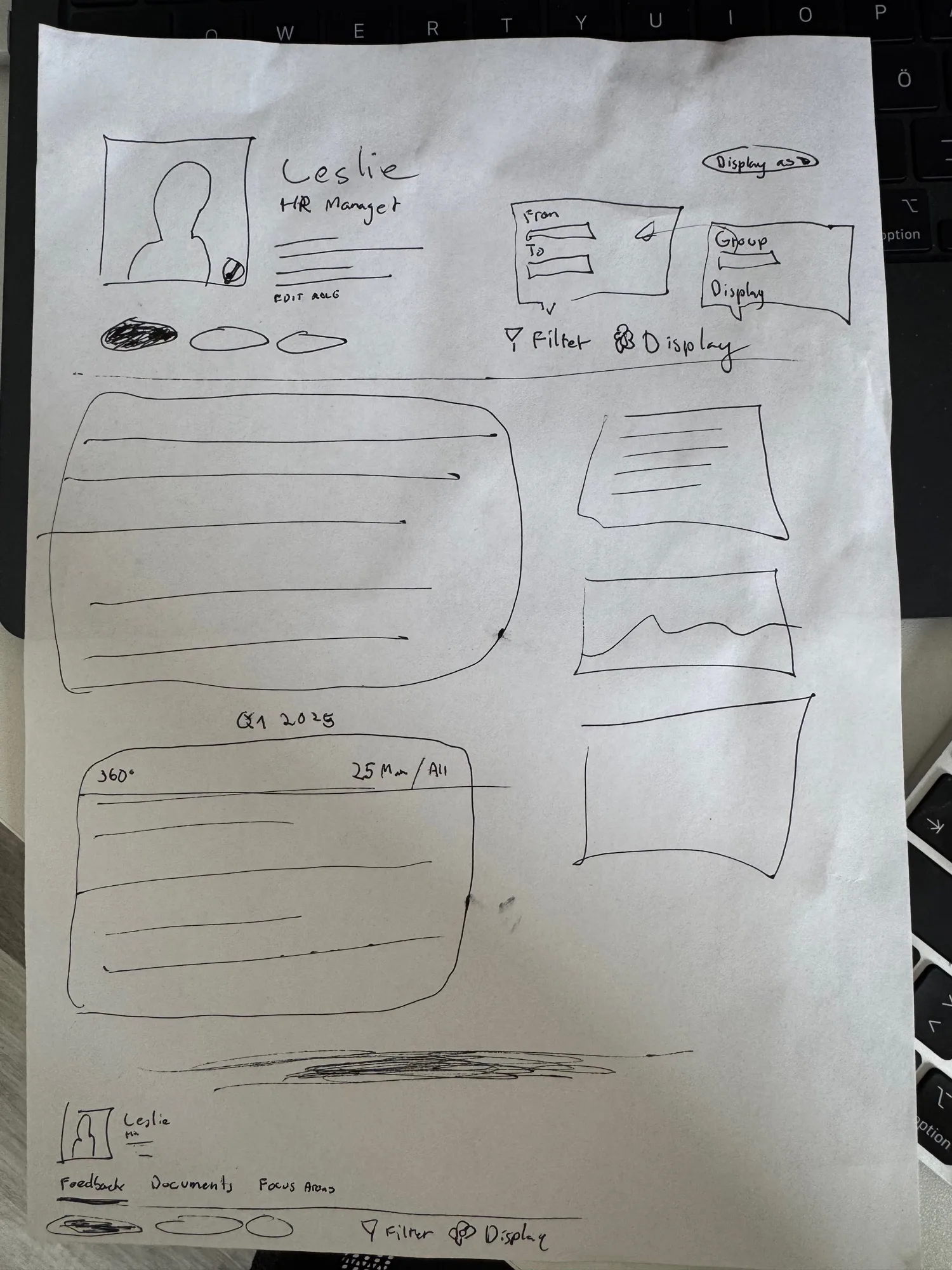
I drew the page once, on a single sheet: profile header, filter and display controls, a stream of feedback grouped by period (Q1 2025, 360°, …), a summary column on the right, and tabs to move between Feedback, Documents and Focus areas.
That sheet was enough to walk the team through the idea, argue about what belongs on the page versus one click away, and agree on the structure. No mockups, no pixel debates, just whether the page tells the right story.
Paper
Shipped
Then straight to code
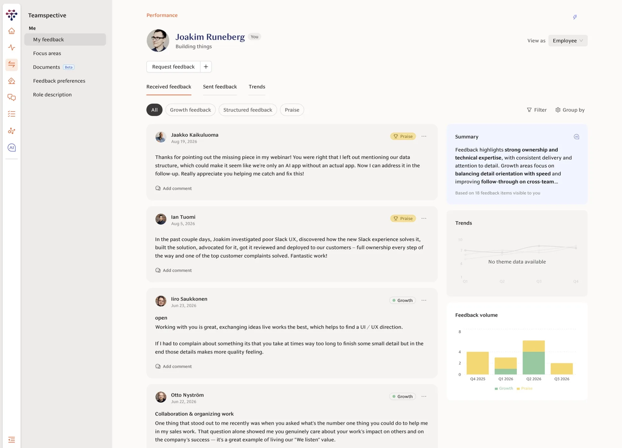
With the structure agreed, I built the page directly in the product instead of in Figma. Real data made the important decisions obvious in a way a mockup never does: how long feedback actually is, how the mix of praise and growth feedback should read at a glance, what an empty trends chart looks like for someone new.
Some things only appeared once the page was real. The tabs became Received, Sent and Trends. Filtering by type (growth, structured, praise) turned into chips rather than a menu. And the summary column earned an AI‑written digest of all visible feedback, alongside trends and a feedback‑volume chart by quarter.
Iterating in the prototype also meant the “design review” was a working page the team could click through, and the gap between approved and shipped was a pull request, not a hand‑off.
Outcome
A feedback view that reads as a story rather than a log, and another data point for the paper‑to‑prototype workflow: think on paper, decide in code.